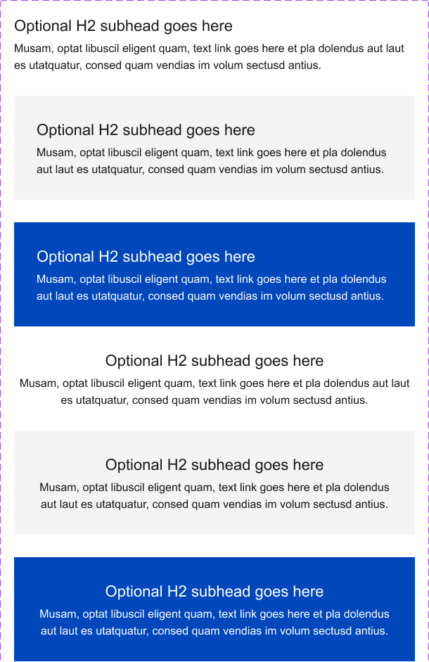
Grid
Utilizing a grid allows for better organization of content. Content can be broken into columns where appropriate.
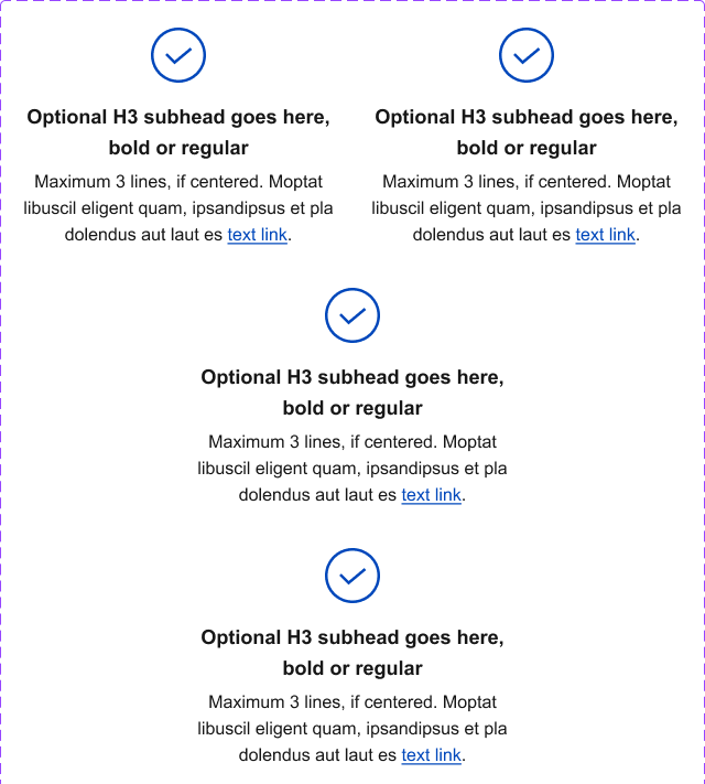
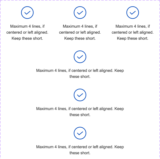
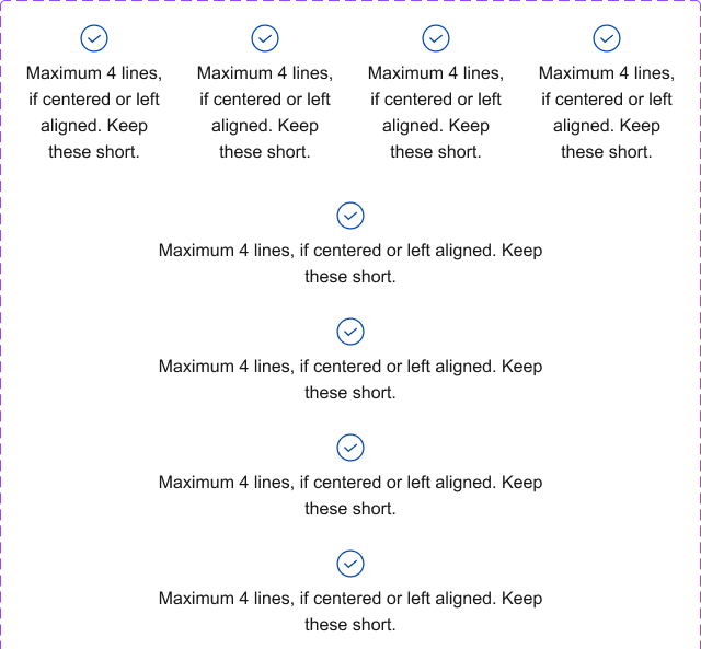
Multiple Columns
Permalink to "Multiple Columns"- Break text into columns where appropriate.
- Pair with complementary icons, if desired.
- Columns can either be separated by gutters or broken into separate boxes.
- Adding icons and/or subheads helps make multiple columns of text feel like separate thoughts as opposed to continuous text set in multiple columns.
Messaging components have been reviewed for compliance with visual accessibility guidelines, but accessibility tool (AT) testing should be performed by those implementing them in code.