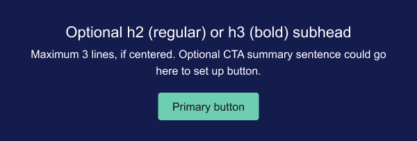
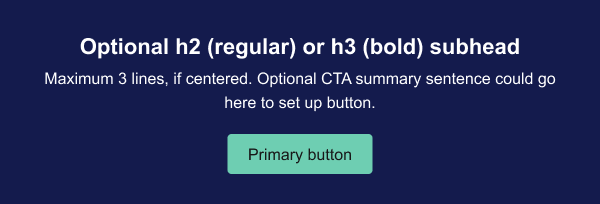
Variations

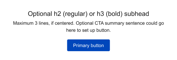
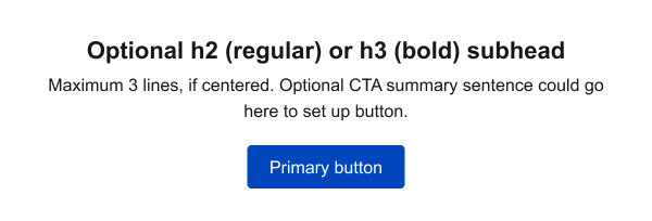
Select a button color that follows the email design and provides enough contrast with its background.

Primary CTA

Primary CTA - with bold subhead

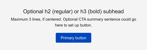
Primary CTA- Gray Background

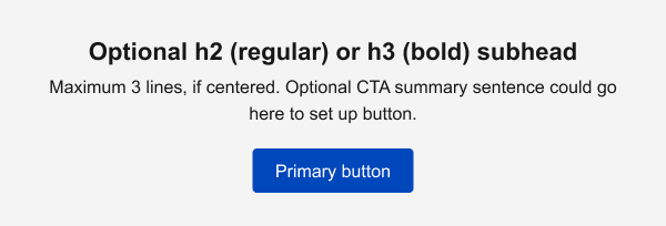
Primary CTA - with bold subhead

Primary CTA- Blue Background

Primary CTA - with bold subhead

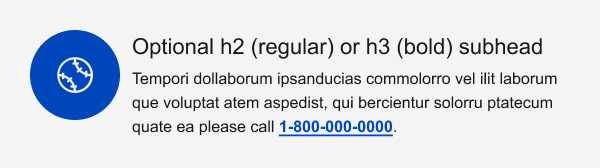
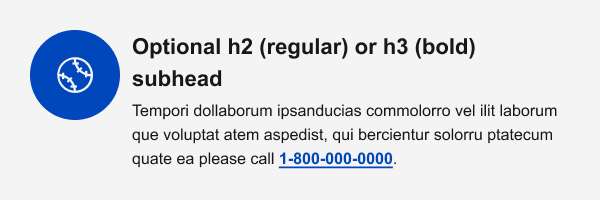
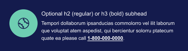
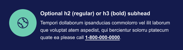
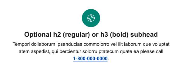
We often provide an additional CTA to encourage email recipients to contact us for further information or take another secondary action.

Icons are often used to draw attention to this message.
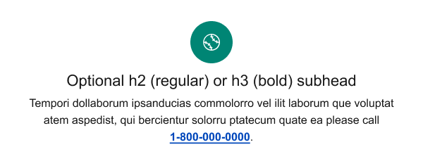
Secondary CTA

Secondary CTA - with bold subhead

Secondary CTA- Gray Background

Secondary CTA - with bold subhead

Secondary CTA- Blue Background

Secondary CTA - with bold subhead

Design guidelines
  • Use at the end of our emails to ensure that there is an opportunity for the reader to engage further.
  • Text for button labels should use sentence case. For example, "Get a quote."
  • Button labels should clearly describe a single event or action that will be triggered when the button is used.
  • Button labels should be as short as possible and include "trigger words" that clearly explain what will happen when the button is used, such as "Download" or "View."
  • Consider making the first word of a button label an action verb. For example, use "File a complaint" instead of "Complaint filing."
  • Keep button labels short, because:
    • Users may not recognize the screen component as a button (and instead see it as a header or other inactive screen component)
    • On smaller devices, button labels may need to look different than other buttons when using a smaller font size or multiple lines of text (making the button look different from what users expect a button to look like)
  • Provide an additional CTA to encourage email recipients to contact us for further information or take another secondary action.
  • Icons are often used to draw attention to this message.
Accessibility

When using the call to action on background colors, ensure there is proper contrast.

  • The call to action must meet a 3:1 contrast.
  • OR, the call to action border to container background must meet a 3:1 contrast.
  • If neither are met, then another background color should be chosen.

Messaging components have been reviewed for compliance with visual accessibility guidelines, but accessibility tool (AT) testing should be performed by those implementing them in code.

Display settings

Note: not all settings persist across pages

Default Compact (-1) Sparse (+1) XL (default) 2XL 3XL Default Min Max Light (default) System Dark Branded (default) Unbranded